Fandango app redesign
For this project, me and three other group members were tasked with choosing an app or website and assessing the issues within of accessibility. Then we were to redesign this service with specific accessibility considerations in mind.
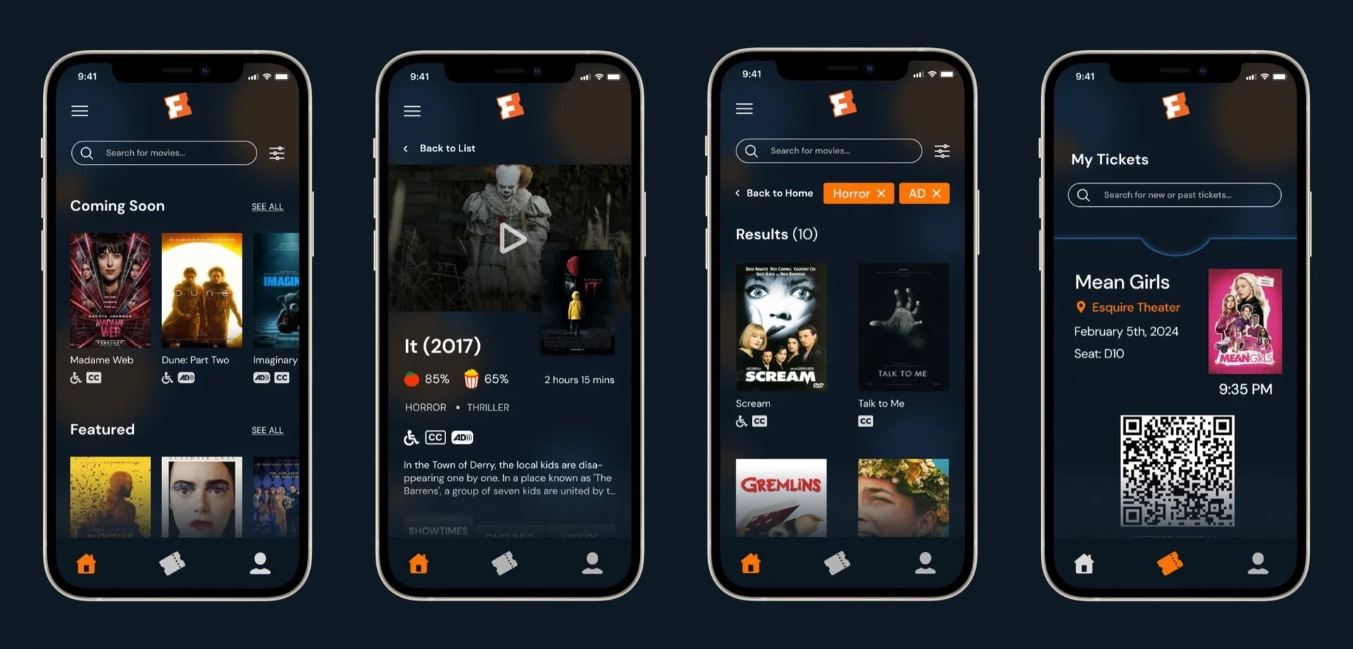
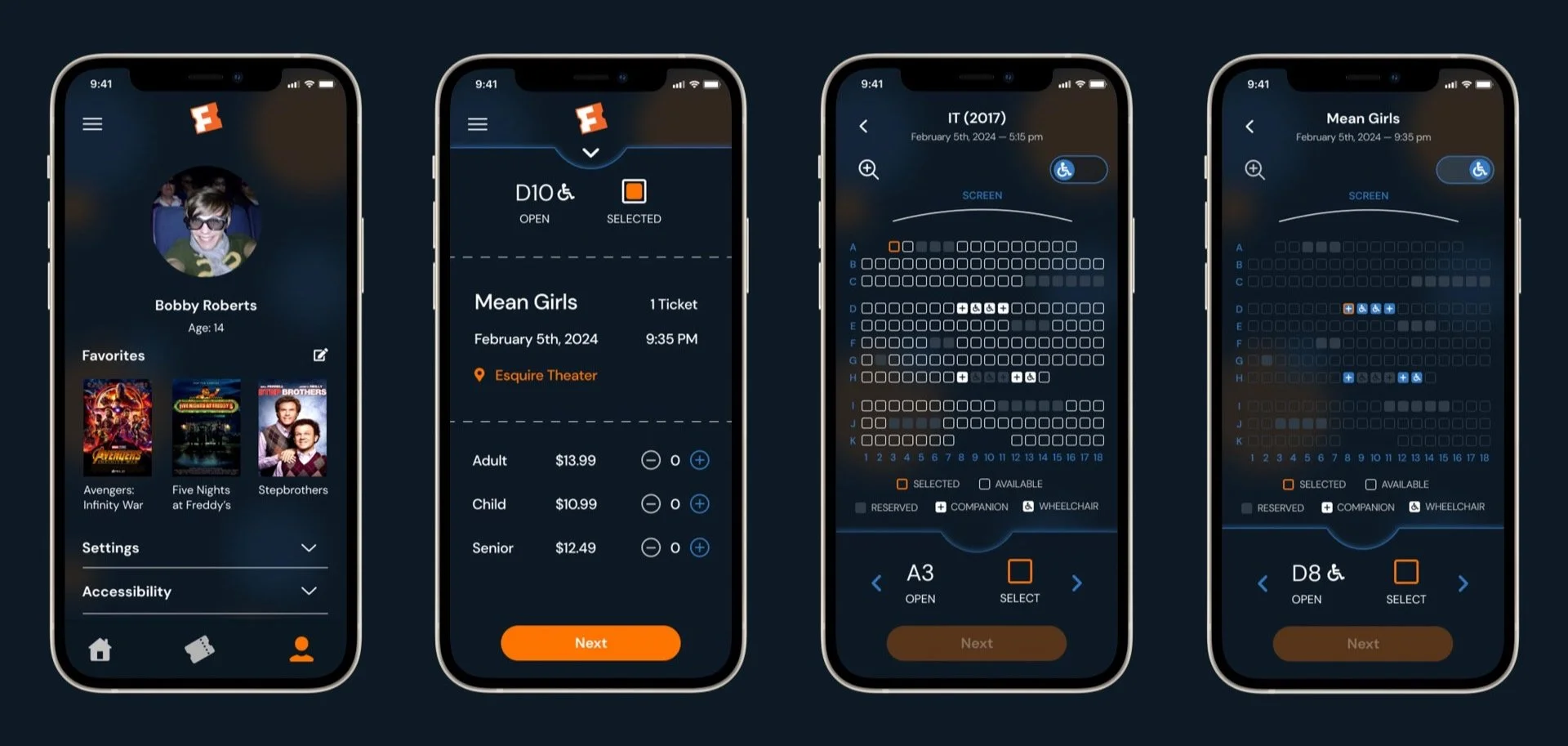
Design Objective: To redesign the Fandango app to create a more streamlined experience that better considers accessibility and aesthetics.
Design opportunities
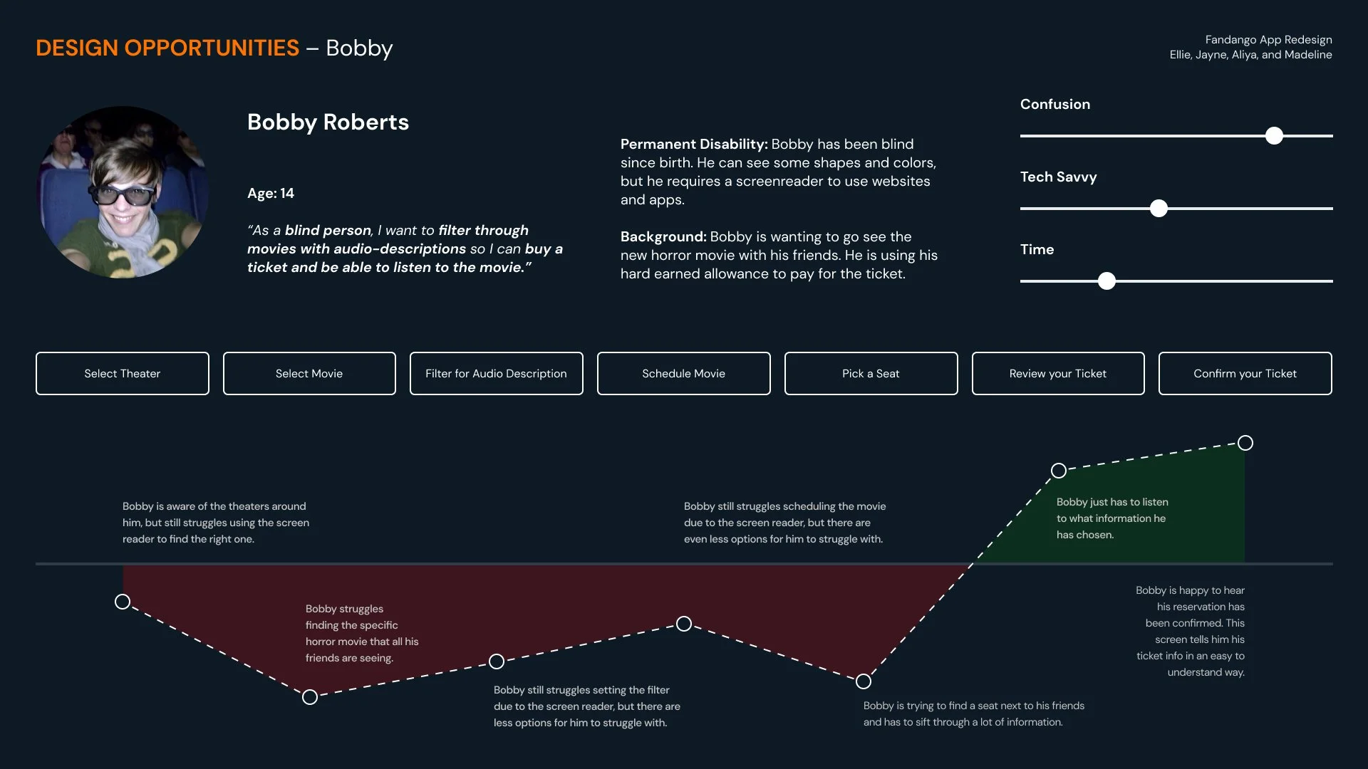
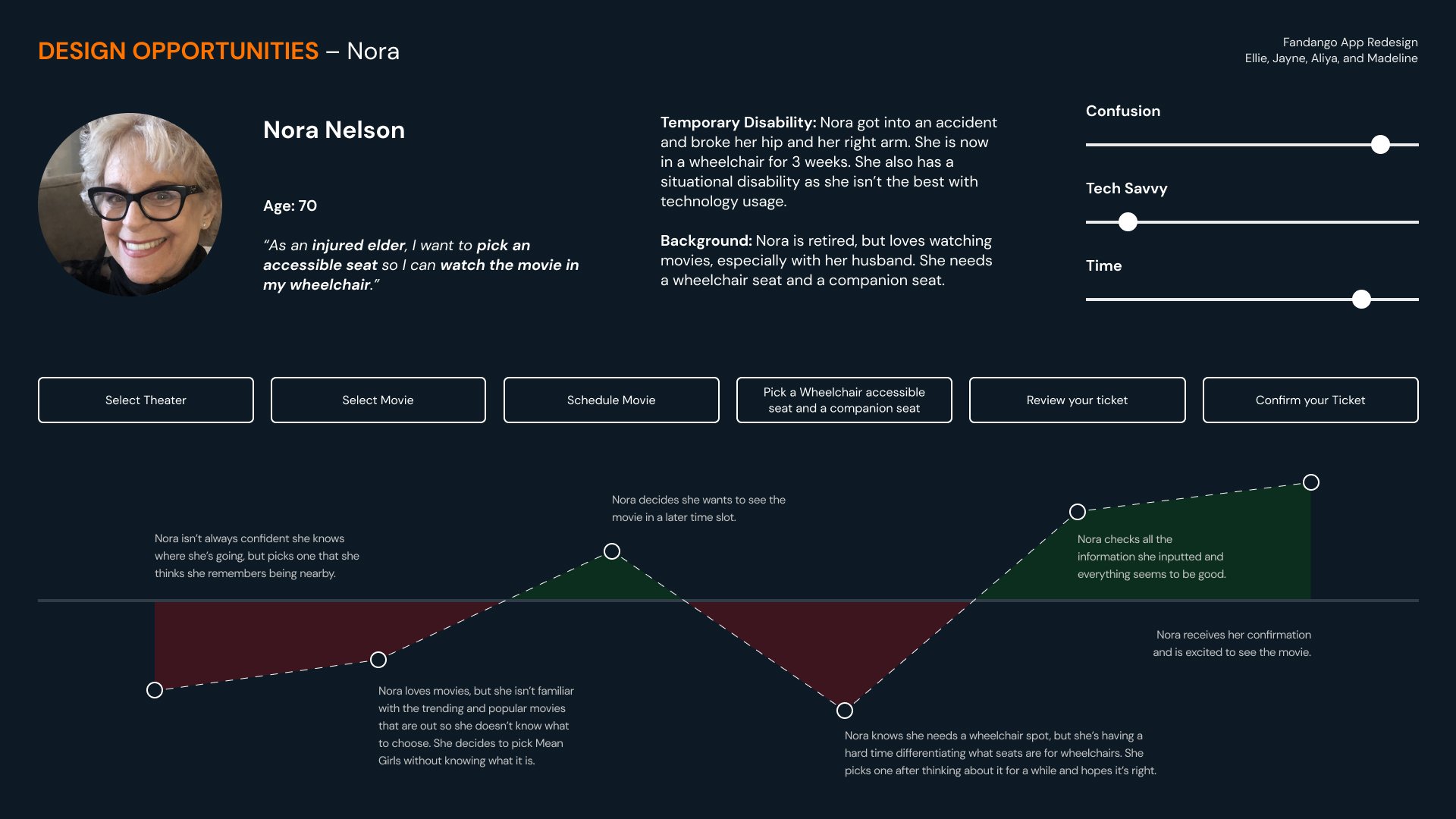
As a group, we decided on what sort of accessibility issues we were going to focus on addressing in the app and who are target audience would be when it came to the changes we were making.
Research
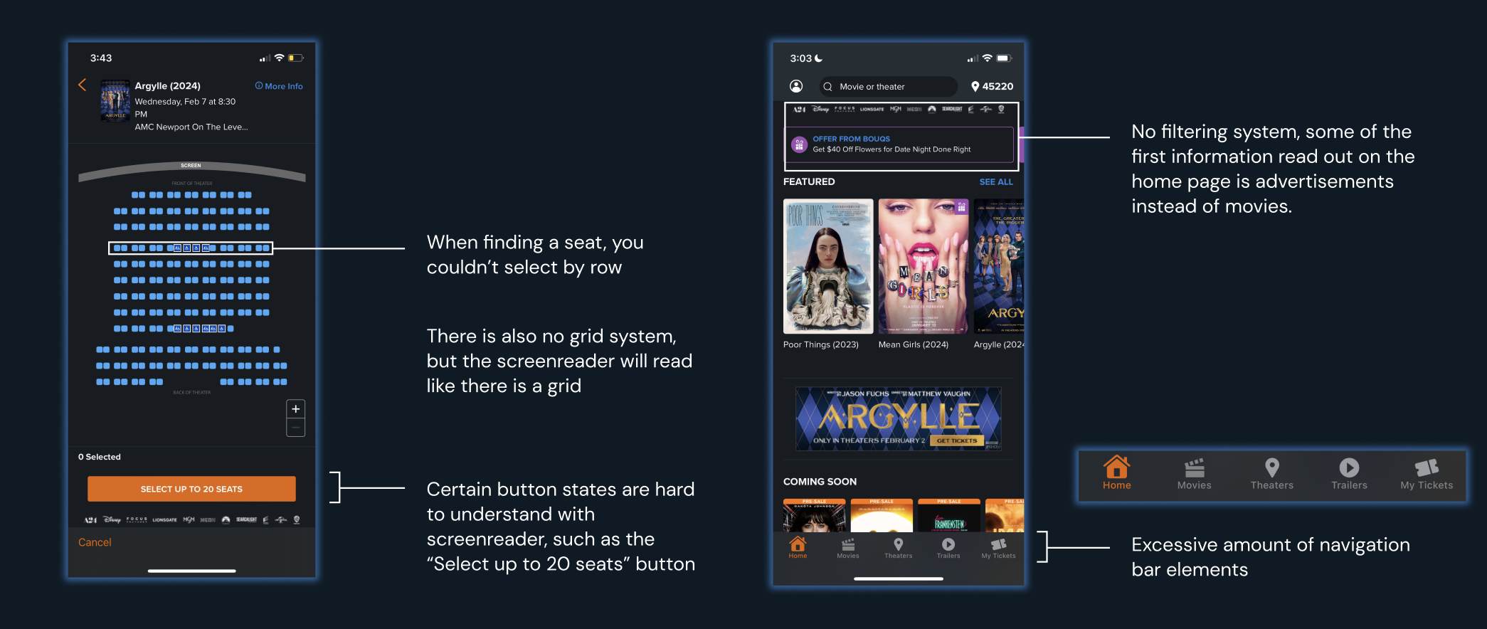
We first looked at Fandango with a screen reader and identified the issues within the app, as well as looked at websites that utilized a screenreader successfully. We also analyzed how wheelchair accessibility was presented in the app.
process work
Sketches
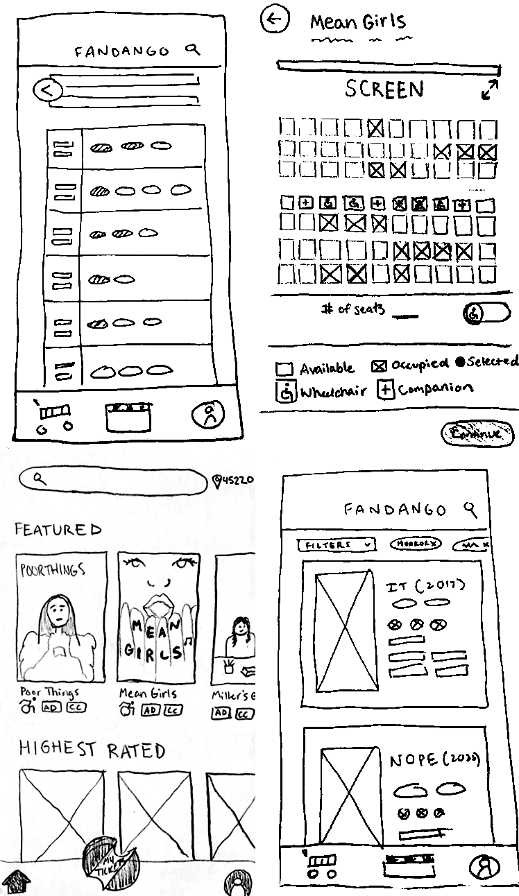
When sketching we played with ideas such as using a grid layout, showing how many seats are open with a pop-up, utilizing more scroll features, etc.
low-fidelity
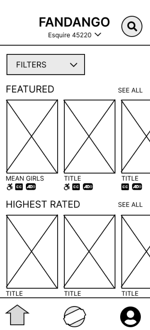
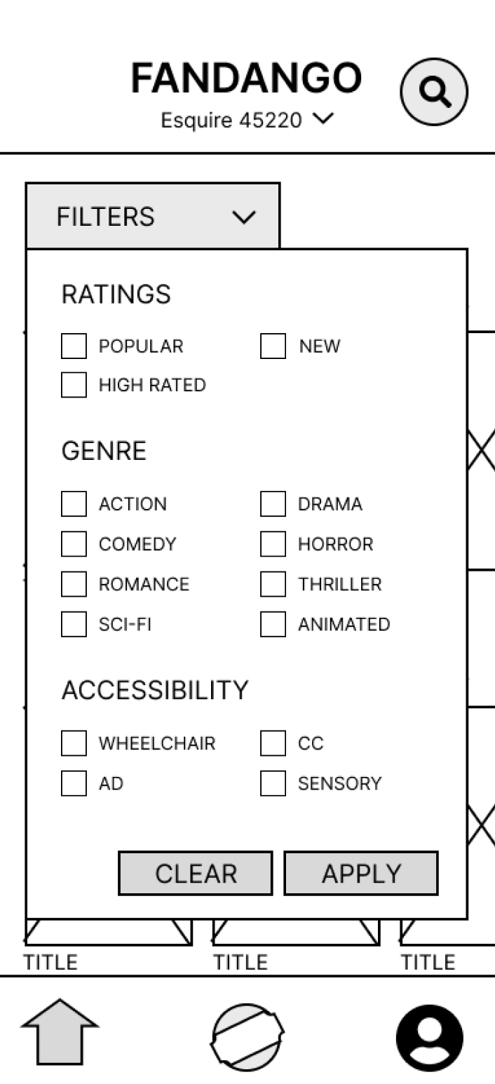
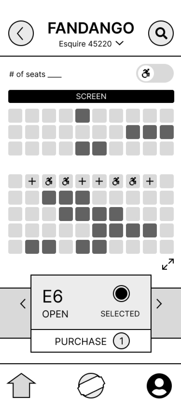
Transferring it to the computer, we focused on showing accessibility on the main screen, what the filters would be, and how selecting a seat would work.
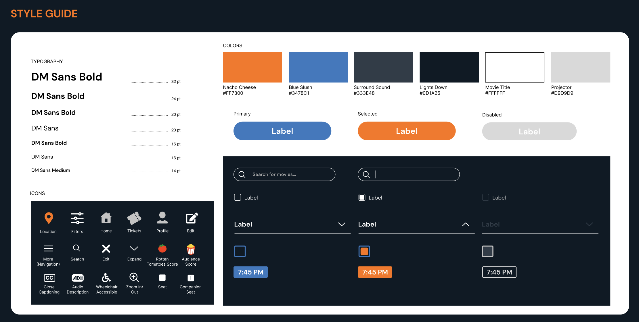
Testing & style guide
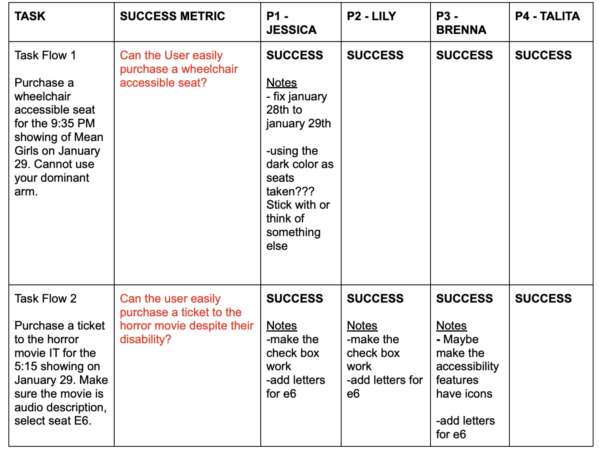
Testing our wireframes, we collected feedback from our classmates as they performed the task flows as if they were our intended audience. We then considered these critiques and applied them to our final task flows as well as our style guide.

